Stable
Steady beats spiky. Stay level.
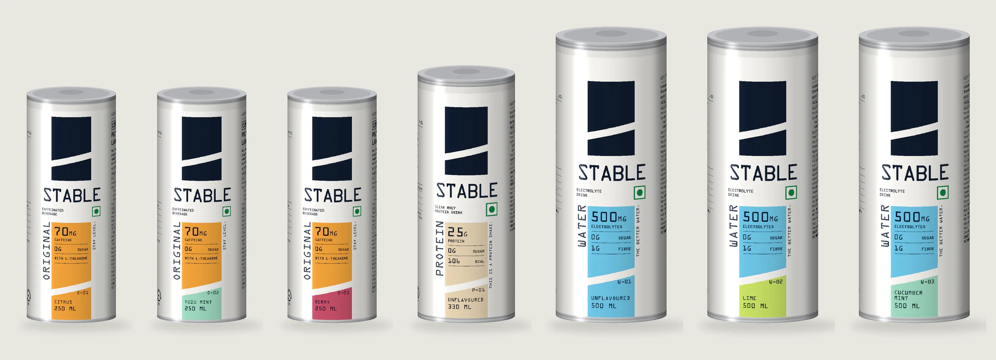
Stable is a functional-drinks brand we built on spec, from the idea to the last line of legal copy: a caffeinated drink, an electrolyte water and a clear protein, with one mark and one packaging system for all three. Its first campaign, three films about the Mehra family, has a page of its own.
The idea
The energy aisle sells highs: big sugar, big caffeine, big claims, then the crash. Stable sells the opposite. Its brand idea is steady beats spiky, and its tagline is two words: Stay level.
The story starts with its fictional founder, Sanyam Mittal, and an afternoon most people know: a can at 3 pm, a crash at 5 and a second can at 6. He wanted energy that stays even, water that hydrates and protein that tastes of nothing, so he put all three under one idea.
- It is the category’s opposite. The energy aisle competes on intensity. In a fridge of loud cans, the quiet one is the one you see.
- One idea holds three products. A caffeine drink, a water and a protein share nothing except the promise of keeping you level. That promise lets one brand own all three, and lets each product sell the next.
- Level is a word the brand can own and the design can draw. It is a feeling, a promise the brand can keep and a shape: a flat line, a reading on an instrument.
- It suits the regulator. “No crash” is a performance claim that needs proof. “Zero sugar” and “70 mg caffeine” are facts. A brand built on honest numbers needs no risky adjectives.
The range
- Stable Original. A caffeinated drink built on the chemistry of matcha: 70 mg of caffeine from green tea, with L-theanine and green-tea catechins, and zero sugar. Stay level.
- Stable Water. Electrolyte water with 500 mg of electrolytes, minerals from red seaweed and fibre from konjac, also sold as a Water Mix sachet. The better water.
- Stable Protein. 25 g of clear whey protein isolate in 330 ml, thin and clear like water. This is a protein shake.
- The Stable Stack. One of each, for one steady day.
It is priced as premium mass and sold through its own website, quick commerce, Amazon, gyms, cafés, offices and campuses, to long-day professionals, students, people who train and anyone who reads labels.
The mark
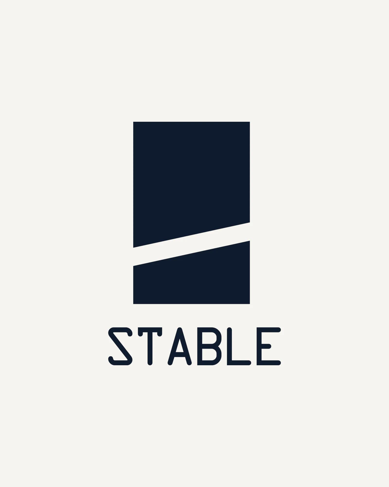
A tall ink block, cut through by one off-white slash that rises gently from left to right. The slope is 12.24°, so it climbs without spiking: a lift you barely feel, and one that holds. That is steady beats spiky in a single stroke.
The first brand book drew a spirit level with its bubble centred. The cut keeps the idea and gives it a job: on every pack it divides the product bar into product and flavour, so the logo is not stuck on the system, it is the system. A block and a line also survive anything, from sachet size to an emboss, one colour or a quick-commerce thumbnail. The wordmark is STABLE in OCR-A capitals, centred under the mark.
Colour and type
Every pack stands on an off-white ground, with all type in ink, a deep navy that is softer than black. Colour lives only in the product bar. The top of the bar tells you the product: amber for Original, aqua for Water, sand for Protein. The bottom tells you the flavour, in mint, berry or lime. Two levels of colour make a range anyone can sort, and the constant ground keeps seven cans and eight cartons reading as one brand on a shelf or a phone screen.
The palette: ink #0F1B2D, off-white #F6F5F0, amber #F2A33A, aqua #6EC6E6, sand #E6D3B3, mint #9ED9C0, berry #C9506A and lime #C9E265.
There are two typefaces, both monospaced. OCR-A, designed in the 1960s for machines to read, sets anything read as a number or a name: the wordmark, the hero numbers, flavours and codes. It makes every number look like an instrument reading, which is the brand’s personality: calm, science-literate, saying the number instead of the adjective. Roboto Mono sets anything read as text, from descriptors to nutrition tables. Because both are monospaced, the whole pack shares one rhythm, and the tables line up without effort.
The voice
Calm, precise and lightly witty. Short sentences, numbers first, no exclamation marks and no superlatives. Every statement on a pack ends on the same two words. This one is on the Protein can:
This is a protein shake. 25 g of clear whey protein isolate in 330 ml, thin and clear like water, with no flavour to get through. Tastes like water. Because it basically is. Zero sugar. Stay level.
The water’s ingredients carry Japanese names, each glossed in plain English on the can. They give Stable Water an ingredient story it can own, and tie it to Original’s matcha roots.
The packaging system
Five principles run through every pack:
- Numbers first. After the logo, the largest thing on a front is one number: 70 MG, 500 MG, 25 G. People who read labels trust a number more than an adjective.
- One column, everywhere. The mark, the wordmark, an info row, then the product bar, scaled to the pack and never redrawn. A 50 mm sachet and a 188 mm carton are instantly the same brand.
- The cut is the logo. The mark’s slash splits every product bar into product above and flavour below.
- A quiet ground. Off-white, ink type and colour only in the bar. Restraint is what makes the colour stand out.
- A steady voice. The copy behaves the way the product promises to: even and measured.
A can wrap reads in thirds. The front column sits in the centre. The left panel carries the statement, what is inside every can and the braille; the right panel carries the warnings, the nutrition table and the legal copy.
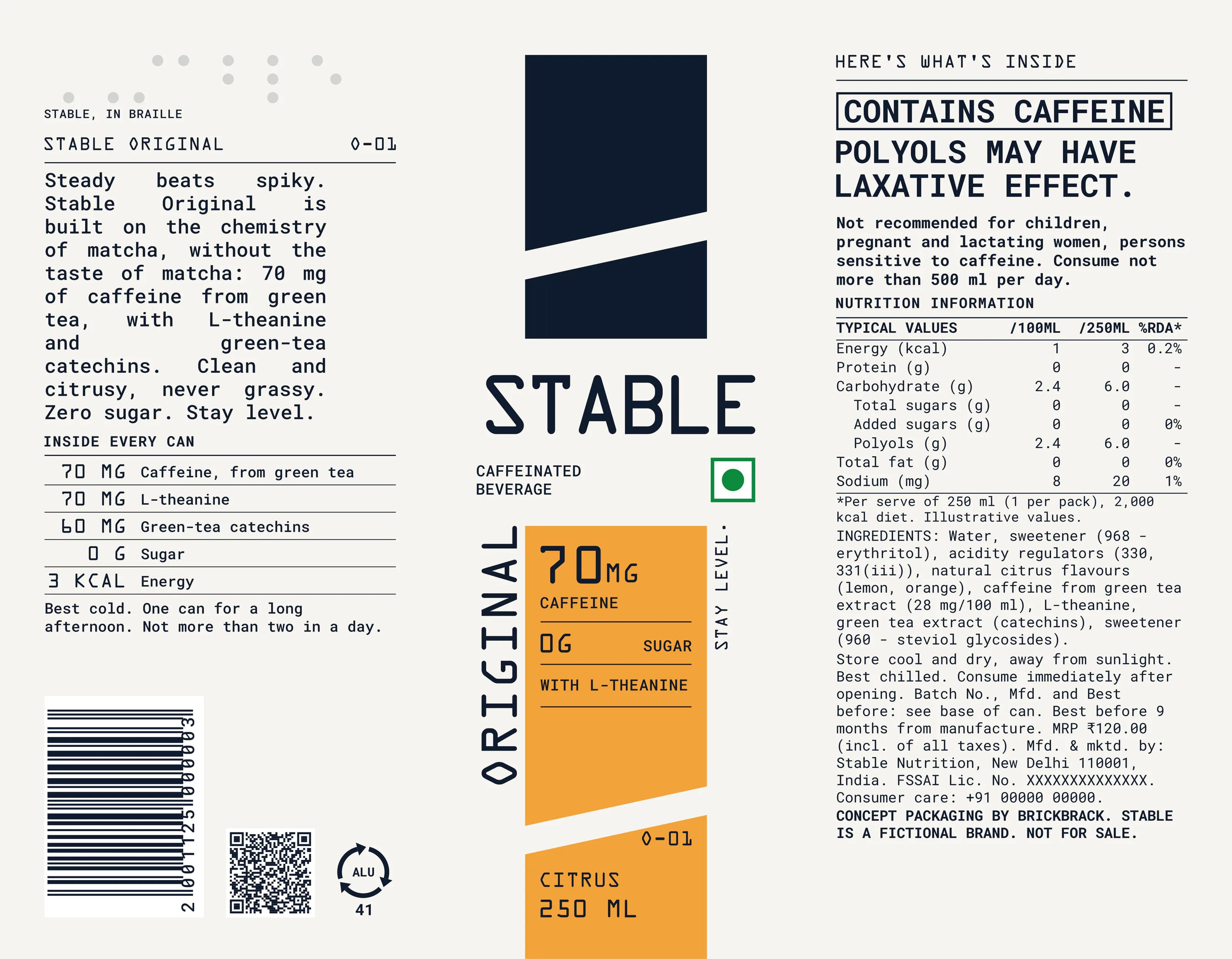
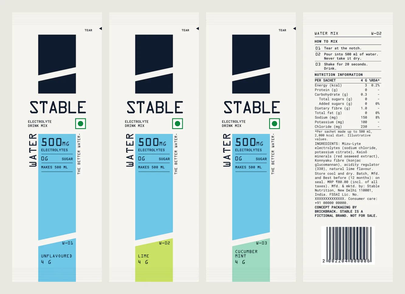
Every product comes in aluminium: one material, one print process and one family of silhouettes on the shelf. The can size tells the products apart before you read a word. Original takes a 250 ml slim can, a measured dose of 70 mg, so two cans make the 500 ml daily limit printed on the label. Protein fills a 330 ml sleek can with 25 g. Water takes a 500 ml standard can, a real drink of water, and a 4 g Water Mix sachet that makes 500 ml.
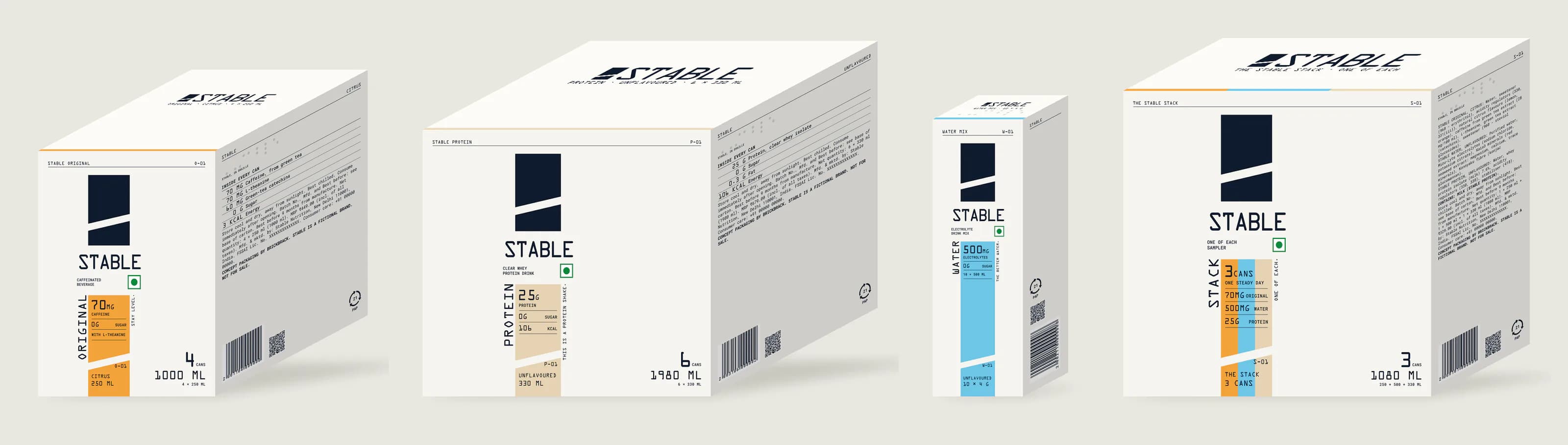
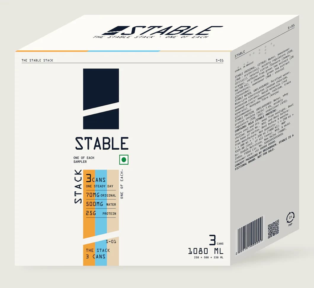
The cartons carry the same column: four Original cans for four long afternoons, six Protein cans for a training week, ten Water Mix sachets as a habit pack, and The Stable Stack, one of each, its bar split into three stripes under one continuous cut. Every flavour has a code, from O-01 to W-03, which gives the range the feel of a lab catalogue.
Built to print
Every pack is generated. One source file holds the products, the copy, the colours and the drawing rules, and builds every can wrap, sachet and carton dieline from them, true to size and with the type outlined for print. A number changed once changes on every pack that carries it.
India’s label rules are built in rather than checked afterwards: minimum sizes for net quantity under the Legal Metrology (Packaged Commodities) Rules, 2011, minimum sizes for mandatory text and the veg mark under the FSSAI Labelling and Display Regulations, 2020, and the caffeine warnings on Original and the Stack. Every can also carries STABLE in braille, as an emboss, so the brand can be read by touch.
Even the names follow the rules. In July 2026 FSSAI issued notices to drinks makers over the term “energy drink”, noting that no standard exists for it. So the caffeine can is called Stable Original and described as a caffeinated beverage. The claims stay within what can be shown: L-theanine and green-tea catechins “as found in matcha”, konjac fibre with no promise of weight loss, and no “no crash” claim until it has been tested.